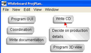
Most projects start with some sort of
brainstorming meeting in which the members of the new project group get together
to discuss what the new project is, how it is going to work, what has to be done
to carry it out etc.

(The number of activities and elements is kept
intentionally very low in order to improve the clarity of the
explanation.)
Relationships between two elements can be represented using
colored arrows. Different types of relationships use different colors.
Either the project leader decides who does what, or the
members of the project volunteer:

So the aspect "Who" has been added to the
original 2-dimensional view.
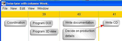
The activities can be put on a time line.

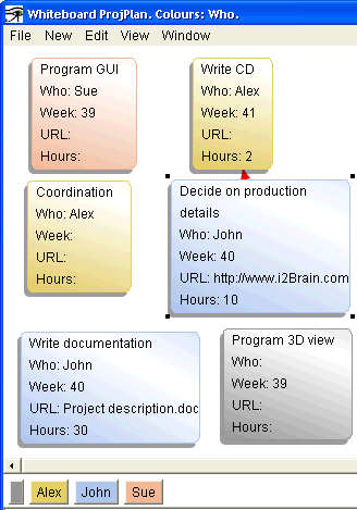
The first view can be made more
easily understood by using colors:

Here all the details of the elements are shown, and a color scheme improves the user's ability to recognise details at a glance. (The
aspects "URL" and "Hours" have been added as well.)